

Type: Self-Initiated
Role: UX Design, UI Design, Research, Illustration
Design Tools:
Adobe Illustrator, Figma, Unsplash Images

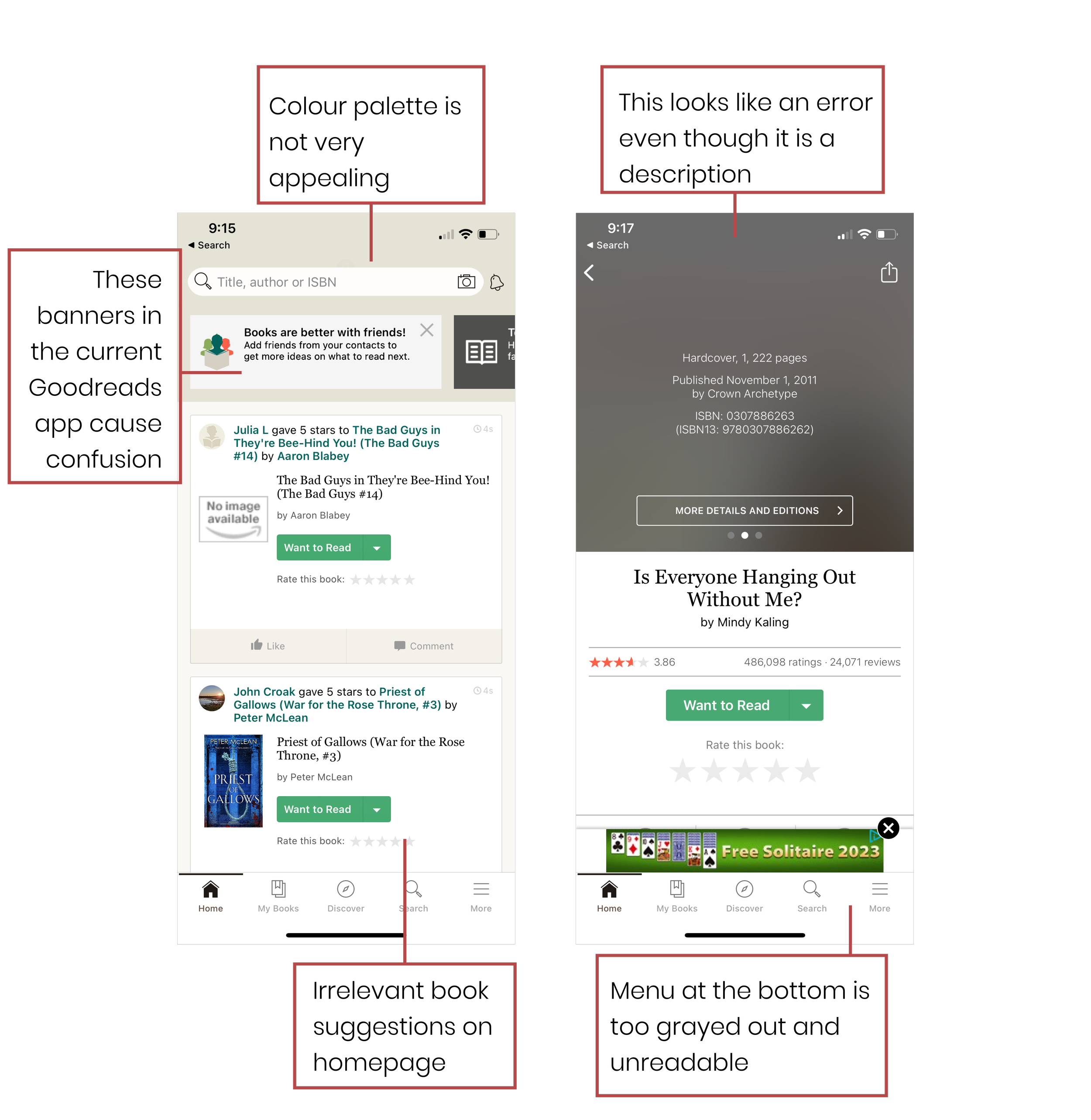
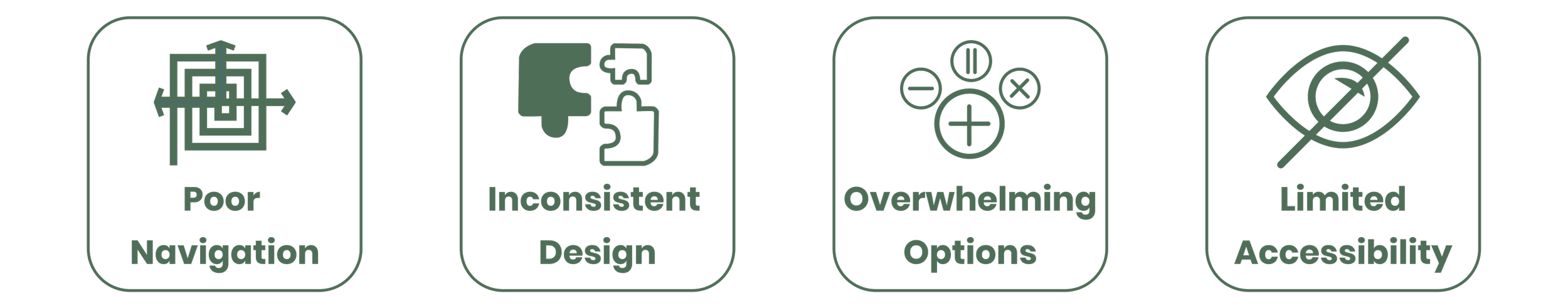
Problem Identification

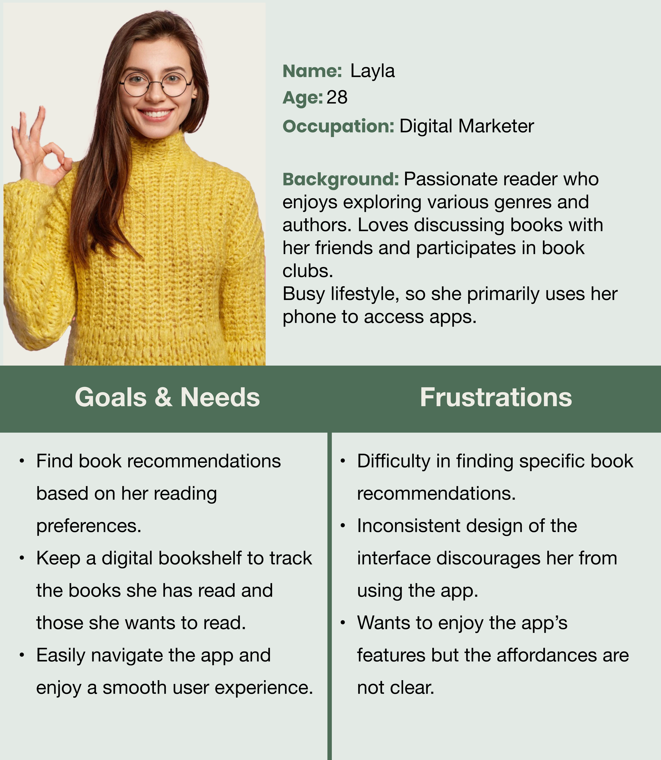
User Personas

What approach should be taken to re-design the Goodreads mobile application to address the issues identified in the original app and reinforce Goodreads’ position as a leading platform for book lovers?
User End Goals:
Find their book of choice easily
Be able to access preview of book
Organize chosen book in a library
Easy navigation will result in the user accessing the app more often
Critical Path:
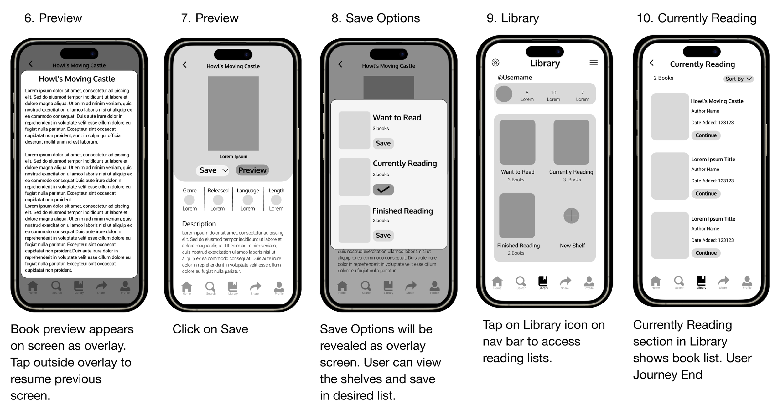
User will open the app and locate the Fantasy books under Genres. The user will preview the book called ‘Howl’s Moving Castle’ and then sort it into the Currently Reading section of the library. The user will then open the library and tap on the Currently Reading section to view their list.
Success Metrics:
Time to complete task : 42 seconds
Total number of clicks: 11

Wireframes

Fonts & Colours

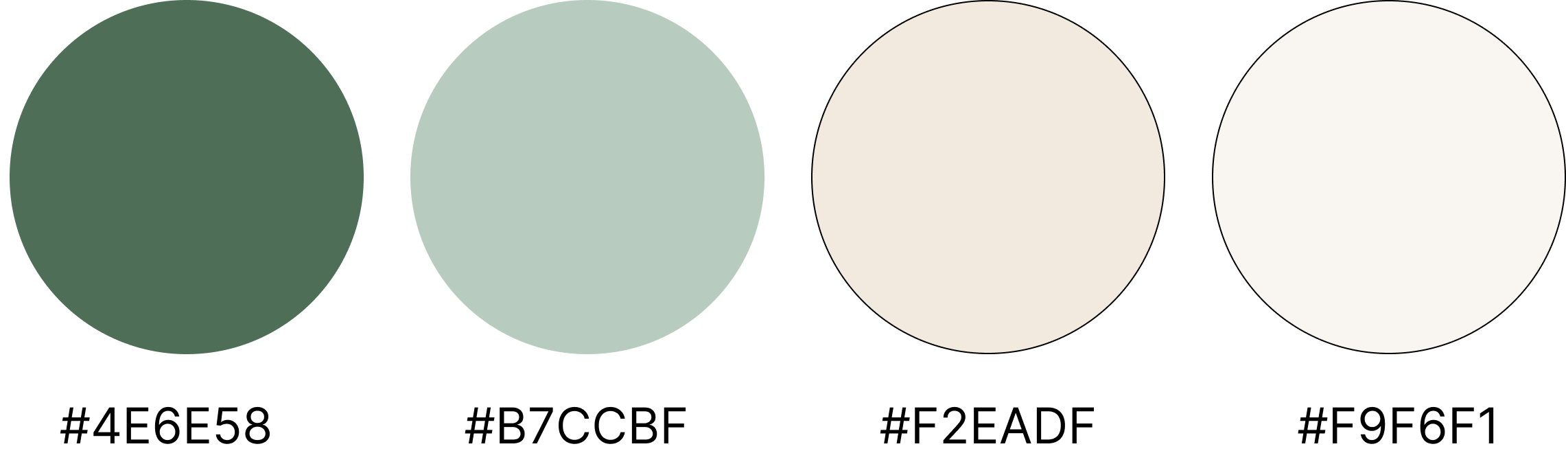
Initially, I considered changing the original colors of Goodreads but decided to use variations of the existing colors instead. The chosen colors represent warmth, balance, and sophistication. The beige tones contrast with the dark green, reminiscent of the color of actual paper, creating a comfortable and familiar reading environment.
User Journey
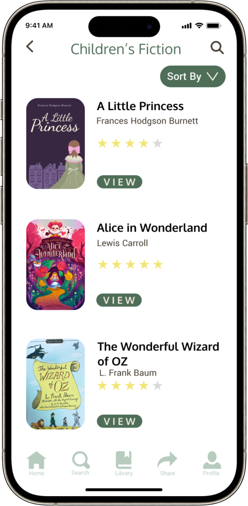
User will open the app and navigate to Genres, where they will access Children’s Literature. Under Children’s Literature, user will view the book called ‘A Little Princess’. User will Preview the book, and then save it to the ‘Currently Reading’ section of the Library. Lastly, User will access the Library and open the Currently Reading section.
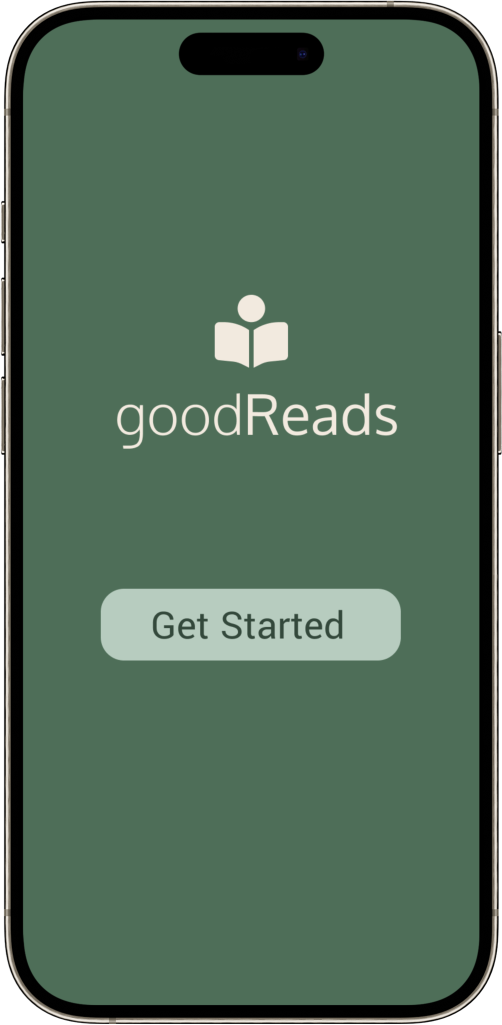
Final Design
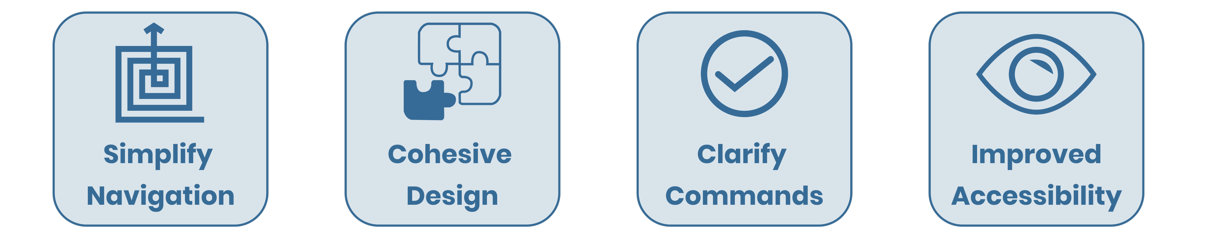
The new design features a consistent layout with a unified visual language. Elements such as buttons, fonts and icons follow a cohesive style guide. I implemented a bottom navigation bar with clear icons and labels, making it easier for users to access different sections of the app. The app is fully responsive, providing a seamless experience across different mobile devices and screen sizes.
To enhance accessibility, I improved on the colour contrast and readability, ensuring the app is usable for a broader audience.


This marks the end of my High fidelity Prototype Design. Not only did I want my design to be simple and easy to navigate, I also tried my best to make the user journey a pleasant experience.
Since apps have a smaller design area, it also means that there are a lot of pages that must be made and connected with each other to ensure proper functionality. While designing the Prototype I focused on the interactivity that related to the User Journey but I also added in elements and indicators that showed how the app would work if it was fully functional. Overall, this has been a good learning experience for me and has made me more aware of the differences and similarities between website and app design.